Web design practices that are no longer "best practices"
As web designers and developers, we’ve tried some experiments, chased some trends, and fallen into some habits. Let’s identify a few of the outdated web design practices that simply need to be abandoned.
1. Unsolicited “subscribe” popups
You’ve experienced this moment. You’re reading an article online, and it’s good. Maybe it’s interesting, and nothing more—or maybe it solves a specific problem you were having. Either way, you’re glad the article exists…
Until the act of scrolling triggers a popup that interrupts your reading. “SUBSCRIBE NOW!!! For more great articles like this one.”
If that popup brings you joy, then you are utterly unique among the eight billion people on this planet.
There are better ways to encourage users to keep coming back. A paragraph or callout at the end of the article is perfectly appropriate. A subscribe button that only triggers when the user chooses to click on it should also be appreciated. And links to your social media accounts—where you are promoting your new articles, right?—will give visitors another way to stay aware of you.
2. “Scroll down” arrows

The World Wide Web became mainstream in the 1990s. This is the fourth decade in which it’s been a part of daily life. If you meet someone today who is still unaware that they can scroll down when they visit a web page, you have every right to be astonished.
By adding a “scroll down” arrow to the page, you risk coming off as pushy or condescending to your visitors, in service to a population of non-scrollers who, as far as we can tell, don’t exist.
There are better ways to get users to scroll. Best of all is to make your content engaging right from the beginning. Or, if you have a large “hero” area at the top of the page, you can take care to keep its height slightly smaller than the viewport height, so that some of your down-page content peeks into the initial view, showing the visitor that there’s more to see.
3. Carousels
Carousels present a host of accessibility problems for users with visual impairments, motor disabilities, or cognitive issues such as attention deficit. They often fail to play well with assistive technologies such as screen readers and keyboard navigation. And they’re sometimes built to auto-advance—moving a slide out of view right while the visitor is in the middle of reading it.
Just as important: research consistently shows that users don’t engage with carousels, even when the carousel is the most prominently positioned element on the page. A carousel is an effective way of putting information into a page if you want that information to be ignored.
The reasons why designers use carousels usually have nothing to do with serving the visitor.
Perhaps a site has a large amount of content, and narrowing down which content to feature on the homepage is difficult. So, to avoid the hard work of making a decision, we surrender to mediocrity and try to include all of the content at once.
Or perhaps a business has numerous stakeholders who all want their content to appear on the front page, whether it belongs there or not—so we appease them by burying their content inside a carousel. Now we can tell that manager they’re on the front page, but the visitor will never have to notice.
There are better options than a carousel, nearly every time. If the content matters, then allow it to be seen. Try putting it in a grid, or a list, or a subsection of its own, or a separate page. And if the content doesn’t matter to your audience, then try omitting it from the page.
4. Hyperlinking phrases like “click here”
It’s a small thing, but good hyperlinks tell you something about the page to which they point. We know that users skim more than they read, so making a link meaningful is a good way to keep them oriented. In addition, meaningful link text will tell search engines something about the page you’re linking to, which could make the page that much more discoverable.
So let’s all stop writing, “To learn more about our philosophy, click here.” A better approach is to write, “We’d love to tell you more about our philosophy.”
5. Forcing all links to open in a new tab
The usability legend Jakob Nielsen writes, with some justification, that “opening up new browser windows is like a vacuum cleaner sales person who starts a visit by emptying an ash tray on the customer’s carpet.” It’s an aggressive choice that prioritizes the marketer’s desires over those of the user.
Users who want to open a link in a new tab already have the ability to do so, using a modifier key, a right-click, or a browser preference setting. By forcing that behavior, you take the choice out of their hands—demonstrating how little you care about their wishes.
In addition, though you may hope to prevent the visitor from leaving your site, your choice to force a new tab disables their Back button. Some users won’t even notice that a new tab has opened. As a result, they’ll be confused and frustrated when they try to use the Back button and find it grayed out. The best guiding principle is to let the user retain control of their own browsing experience.
6. Unlabeled form fields
The placeholders you sometimes see inside a form field are meant to serve as examples of the content that a user might enter in the field. Inside an “Email address” field, for example, you might see “john.smith@email.com” as a placeholder. But using placeholders as if they were field labels poses accessibility and usability problems.
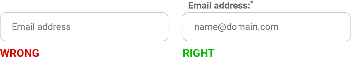
If a user has an older browser that doesn’t support placeholders at all, they might see your form as a series of blank, unlabeled fields. But even for a perfectly abled user with the latest browser, it’s inconvenient to click (or tab) into a field and have the name of that field disappear from view. Users might have to click out of that field again, just to remind themselves: Was this supposed to be Company Name, or Job Title? It’s a better practice to keep the labels outside of the form fields, so you aren’t increasing the cognitive load on your users.
There’s always room to improve our habits as web designers and developers. By evolving beyond intrusive design patterns, prioritizing clear communication and accessibility, and respecting user autonomy, we can build more satisfying and effective web experiences that serve our users and our own business goals.
![[author photo]](https://www.adamsknight.com/images/people/chas-lineart-133.png)
